Why Does My Painting Look Flat? (And How to Fix It)
Why Does My Painting Look Flat? (And How to Fix It)
Table of Contents
- The #1 Reason Paintings Look Flat
- The "Squint Test" (And Why It Often Fails)
- The Science of Depth: Understanding Visual Cues
- 3 Common Mistakes Beginners Make
- How to Fix a Flat Painting in 3 Steps
- Manual Checks Before Using Tools
- Try It Now
- Frequently Asked Questions
Have you ever spent hours working on a painting, getting the colors just right, only to step back and feel like something is... missing? The objects look like cardboard cutouts. The scene lacks depth. In short, your painting looks flat.
You're not alone. This is one of the most common frustrations for beginner and intermediate artists. The struggle to create the illusion of three-dimensional space on a two-dimensional surface is as old as art itself.
The good news? The solution is rarely about adding more detail or fixing your specific colors. It's almost always about tonal values.
The #1 Reason Paintings Look Flat
When a painting looks flat, it usually means there isn't enough contrast between light and dark.
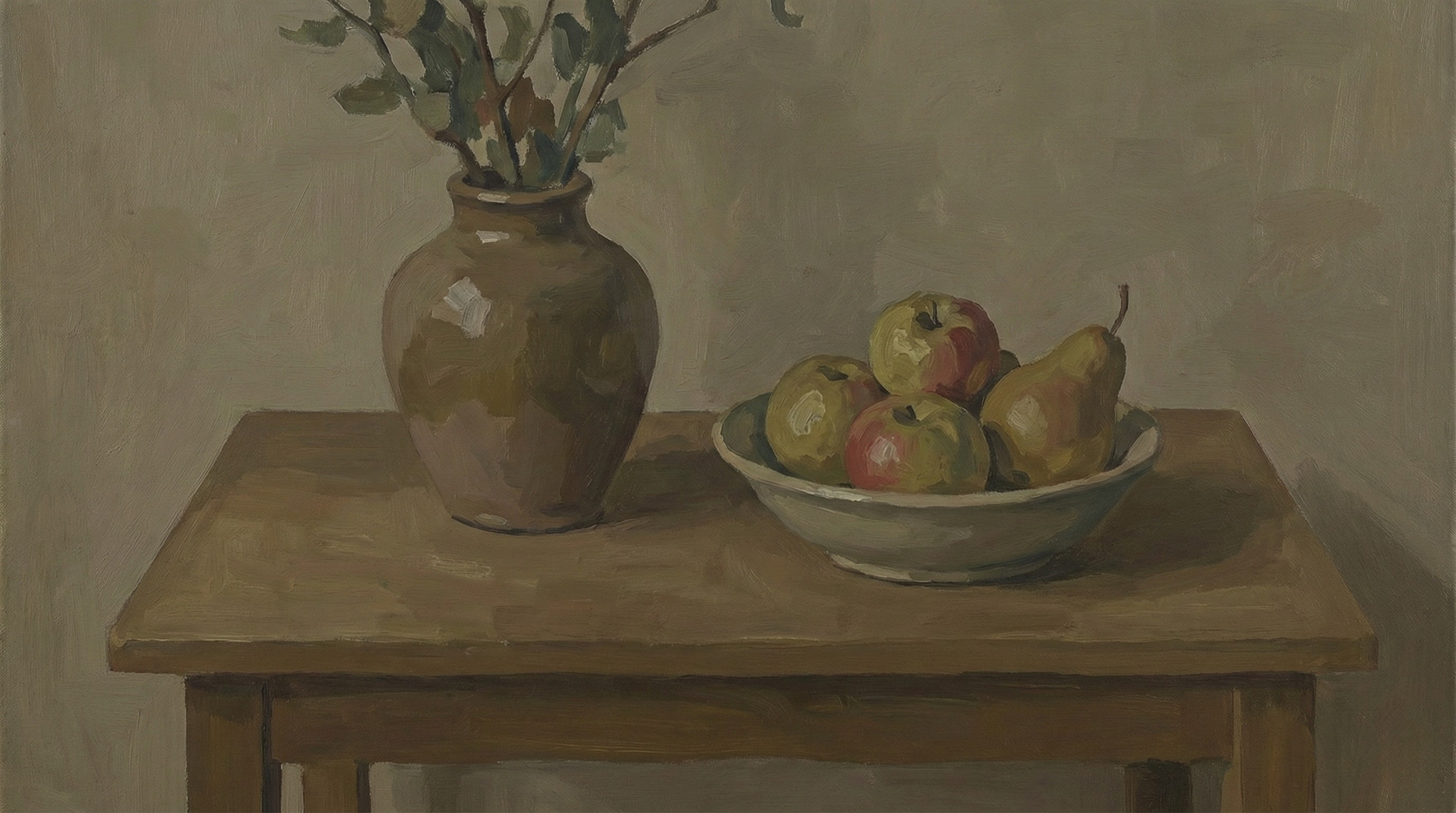
In the real world, we see depth because of light and shadow. A ball looks round because it has a bright highlight, a range of mid-tones, a core shadow, and reflected light. If you paint that ball with only mid-tones, it will look like a flat circle, no matter how perfect the red or blue hue is.
"Value does all the work, color gets all the credit."
This famous art saying holds the key to fixing your flat paintings. Tonal value is the lightness or darkness of a color. If your tonal values are incorrect, your painting will never have true depth, regardless of your brushwork or color matching skills.
The "Squint Test" (And Why It Often Fails)
Traditional art teachers will tell you to "squint" at your subject. Squinting reduces the amount of light entering your eyes, which diminishes color saturation and helps you see values more clearly. It effectively turns your vision into "grayscale mode."
While this works wonderfully for experienced artists who have trained their eyes for years, it's often hard for beginners to do effectively. You might squint and still be confused by the vibrant colors, unable to tell if a bright red apple is lighter or darker in value than the dull blue tablecloth behind it.
This is where modern technology can be a massive shortcut for your learning curve.
The Science of Depth: Understanding Visual Cues
To fix flatness, you need to understand why our brains perceive depth. Beyond just light and shadow, there are other factors at play:
1. Form Shadows vs. Cast Shadows
- Form Shadows are the shadows on the object itself (like the dark side of a face). They turn gradually and define the volume of the object.
- Cast Shadows are the shadows the object throws onto the ground or other objects. These ground the object in space.
- The Fix: Make sure your cast shadows are generally darker and have sharper edges than your form shadows.
2. Atmospheric Perspective
Objects further away generally look lighter, bluer, and have less contrast than objects close to the viewer.
- The Fix: If your background trees are as dark and contrasty as your foreground trees, your landscape will look flat. Lighten the values in the distance.
3 Common Mistakes Beginners Make
Before we jump into the fix, let's diagnose if you are falling into these common traps:
Mistake 1: "The Timid Shadow"
Many beginners are afraid to use pure black or very dark colors. They mix a "shadow color" that is only slightly darker than the mid-tone.
- Result: The object looks washed out and lacks punch.
Mistake 2: "The White Highlight Everywhere"
Conversely, saving your brightest white for everything kills depth. If the white of a distant cloud is as bright as the highlight on a metal vase in the foreground, the spatial illusion breaks.
- Result: The scene looks scattered and confusing.
Mistake 3: "The Mid-Tone Trap"
This is the most common cause of flat paintings. The artist spends 90% of their time painting in the middle gray range, avoiding both deep darks and bright lights.
- Result: A muddy, low-contrast image that feels lifeless.
How to Fix a Flat Painting in 3 Steps
Instead of guessing whether your values are correct, you can use our free Tonal Value Tool to see exactly where your values are going wrong.
Step 1: Analyze Your Reference Photo
First, you need to see the actual value structure of your subject. Your brain often "lies" to you about values, making shadows look lighter than they really are to help you see details.
- Go to the Image Processor section on our homepage.
- Upload your reference photo.
- Set the Tonal Levels to 3 or 4.
This will strip away the color and detail, showing you the simplified value structure. You'll immediately see the "big shapes" of light and dark that create depth.
Step 2: Compare It to Your Painting
Now, take a photo of your painting and run it through the same tool.
Compare the two results side-by-side.
- Are your darks dark enough? Check the deepest shadow shapes.
- Are your lights light enough? Check your highlights.
- Do you have too many mid-tones? If the tool shows your painting as mostly one gray blob, you need to push the contrast.
Step 3: Posterize for Boldness
If your painting feels messy and flat, use the Posterize feature (try the "Pixel" or "Region" modes in the tool). This forces you to make clear decisions: "Is this shape light or dark?"
By painting these distinct value shapes instead of trying to blend everything perfectly, you'll naturally create more structure and depth.
Manual Checks Before Using Tools
If you're painting plein air or don't have access to the tool right now, try these manual checks:
- The Black Mirror: Look at your subject through your smartphone screen (while it's turned off). The reflection reduces contrast and saturation, helping you judge values.
- The Thumb Test: Hold your thumb up next to the subject. Compare the value of your thumb (which is a constant reference) to the shadow you are painting. Is the shadow darker or lighter than your thumb?
Try It Now
Don't let a flat painting discourage you. The fix is often just a few dark accents or bright highlights away.
Check Your Values with the Free Tool
Don't let a flat painting discourage you. The fix is often just a few dark accents or bright highlights away.
Use Tonal Value ToolFrequently Asked Questions
Why does my acrylic painting look flat?
Acrylics dry darker than they appear when wet. This "color shift" can mess up your values. Always mix your highlights a bit lighter than you think you need. Also, acrylics dry flat physically. Using a gloss medium or varnish can restore the depth of the colors.
Can varnish fix a flat painting?
Varnish adds saturation and deepens the darks, which can help reduce flatness. However, varnish cannot fix incorrect value relationships. If you painted a shadow too light, varnish won't make it look correct—it will just make it a shiny wrong value.
What is the "value hierarchy"?
Value hierarchy means deciding what is the darkest dark and the lightest light in your painting before you start. Usually, the highest contrast should be at your focal point.
Summary checklist to add depth:
- Check your contrast: Ensure you have a full range of values from white to black.
- Simplify: Don't get lost in details; get the big value shapes right first.
- Check Atmospheric Perspective: Are distant objects lighter and lower contrast?
- Use the tool: Upload your reference to the Tonal Value Tool to see the hidden value structure.
Start seeing values correctly, and your paintings will never look flat again.